4. Angular Core Concepts
4. Angular Core Concepts
Section titled “4. Angular Core Concepts”4.1 Components
Section titled “4.1 Components”Simple Words First 🟡
Section titled “Simple Words First 🟡”A component is like a LEGO brick. Each brick is self-contained — it has its own shape, color, and connector. You combine bricks to build something big. In Angular, each component controls one piece of the UI, and you combine them to build the whole app.
A typical web page broken into components:
┌─────────────────────────────────────┐│  <app-root>                         ││  ┌───────────────────────────────┐  ││  │  <app-header>                 │  ││  │    Logo | Nav | Search        │  ││  └───────────────────────────────┘  ││  ┌───────────────────────────────┐  ││  │  <app-sidebar>                │  ││  │    Menu items                 │  ││  └───────────────────────────────┘  ││  ┌───────────────────────────────┐  ││  │  <app-product-list>           │  ││  │  ┌────────┐  ┌────────┐       │  ││  │  │<app-   │  │<app-   │       │  ││  │  │product │  │product │       │  ││  │  │-card>  │  │-card>  │       │  ││  │  └────────┘  └────────┘       │  ││  └───────────────────────────────┘  ││  ┌───────────────────────────────┐  ││  │  <app-footer>                 │  ││  └───────────────────────────────┘  │└─────────────────────────────────────┘
Anatomy of a Component
Section titled “Anatomy of a Component”A Component always has 3 parts (usually split into separate files):
// user-card.component.ts — The Component class (LOGIC)@Component({  selector: 'app-user-card',            // 1. The HTML tag  templateUrl: './user-card.component.html',  // 2. The HTML template  styleUrls: ['./user-card.component.css']    // 3. The CSS styles})export class UserCardComponent {  // Properties = Data  userName: string = 'Alice';  userAge: number = 28;  isActive: boolean = true;
  // Methods = Behavior  greetUser(): string {    return `Hello, ${this.userName}!`;  }
  toggleActive(): void {    this.isActive = !this.isActive;  }}
<!-- user-card.component.html — The Template (VIEW) --><div class="user-card"> <h2>{{ userName }}</h2> <!-- Show the userName property --> <p>Age: {{ userAge }}</p> <p>Status: {{ isActive ? 'Active' : 'Inactive' }}</p> <button (click)="toggleActive()">Toggle Status</button></div>/* user-card.component.css — The Styles (LOOK) *//* These styles ONLY apply to THIS component — no leaking! */.user-card { border: 1px solid #ddd; padding: 16px; border-radius: 8px;}Generating a Component with CLI
Section titled “Generating a Component with CLI”# Creates 4 files automaticallyng generate component user-card
# Output:# CREATE src/app/user-card/user-card.component.html# CREATE src/app/user-card/user-card.component.ts# CREATE src/app/user-card/user-card.component.css# CREATE src/app/user-card/user-card.component.spec.ts# UPDATE src/app/app.module.ts (adds to declarations)Component Lifecycle Hooks
Section titled “Component Lifecycle Hooks”@Component({ ... })export class UserCardComponent implements OnInit, OnDestroy {
// Called ONCE after component is created ngOnInit(): void { console.log("Component is ready! Load data here."); this.loadUserData(); // ← Fetch data from API here }
// Called when component is removed from DOM ngOnDestroy(): void { console.log("Component is destroyed. Clean up here."); // Cancel subscriptions, clear timers here }
// Called when @Input values change ngOnChanges(changes: SimpleChanges): void { console.log("Input data changed:", changes); }
// Called after view is initialized ngAfterViewInit(): void { console.log("Template is rendered. Access DOM here."); }}4.2 Templates
Section titled “4.2 Templates”Simple Words First 🟡
Section titled “Simple Words First 🟡”A template is the HTML face of your component. But it’s not plain HTML — it’s super-powered HTML with Angular-specific syntax that can display dynamic data, react to events, and conditionally show/hide things.
<!-- Plain HTML does this: --><h1>Hello, World!</h1>
<!-- Angular Template does this: --><h1>Hello, {{ currentUser.name }}!</h1>   ← Shows REAL data from component<p *ngIf="currentUser.isActive">✅ Active</p>  ← Conditional rendering<li *ngFor="let item of items">{{ item }}</li>  ← Loops<input [(ngModel)]="searchTerm">               ← Two-way binding<button (click)="handleClick()">Click</button> ← Event handling
Inline Template vs External Template File
Section titled “Inline Template vs External Template File”// Option 1: Inline Template (for SMALL components)@Component({ selector: 'app-badge', template: ` <span class="badge">{{ label }}</span> `, styles: [` .badge { background: blue; color: white; padding: 4px 8px; } `]})export class BadgeComponent { label = 'New';}
// Option 2: External Files (PREFERRED for most components)@Component({ selector: 'app-user-profile', templateUrl: './user-profile.component.html', styleUrls: ['./user-profile.component.css']})export class UserProfileComponent { }4.3 Modules
Section titled “4.3 Modules”Angular App Structure
Section titled “Angular App Structure”flowchart TB subgraph App["Angular Application"] Comp["🏗️ Component\nUI + Logic\nTypeScript Class"] Temp["📝 Template\nHTML + Bindings\nWhat user sees"] Serv["🔧 Service\nBusiness Logic\nData + Methods"] DI["🔌 Dependency Injection\nAngular provides services\nto components"] end
Comp -->|"uses"| Temp Comp -->|"injected with"| DI DI -->|"delivers"| Serv Temp -->|"async pipe"| Serv
style Comp fill:#7c3aed,color:#fff style Temp fill:#4f46e5,color:#fff style Serv fill:#059669,color:#fff style DI fill:#d97706,color:#fffSimple Words First 🟡
Section titled “Simple Words First 🟡”A module is like a department in a company. The HR Department has its own people, tools, and rules — it’s self-contained. The IT Department is the same. They work independently but can share resources when needed.
In Angular, a Module groups related components, services, and pipes together.
@NgModule({ declarations: [ // ← Components/Directives/Pipes IN this module UserListComponent, UserDetailComponent, UserCardComponent, UserAvatarPipe ], imports: [ // ← Other modules this module NEEDS CommonModule, // ngIf, ngFor etc. FormsModule, // ngModel (two-way binding) HttpClientModule, // HTTP requests RouterModule // Routing ], providers: [ // ← Services available in this module UserService ], exports: [ // ← Components/Directives available to OTHER modules UserListComponent, UserCardComponent // Other modules can use this after importing UsersModule ]})export class UsersModule { }The Root Module (AppModule)
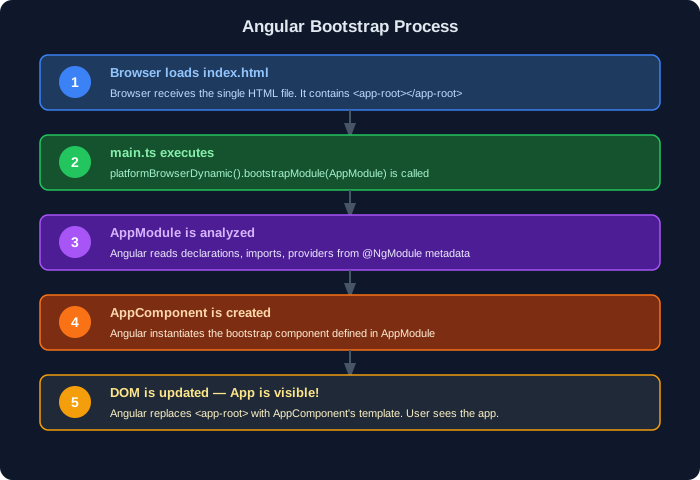
Section titled “The Root Module (AppModule)”// app.module.ts — The MAIN module that ties everything together@NgModule({ declarations: [ AppComponent // Root component MUST be here ], imports: [ BrowserModule, // Required for browser apps (replaces CommonModule in root) UsersModule, // Our custom feature module ProductsModule ], providers: [ AuthService // App-wide service ], bootstrap: [AppComponent] // ← The FIRST component Angular renders})export class AppModule { }4.4 Metadata & Decorators
Section titled “4.4 Metadata & Decorators”Metadata is the configuration object you pass to a decorator. It tells Angular how to use the class.
// @Component decorator with METADATA object@Component({  // ── Required ──  selector: 'app-user',          // The HTML tag name
  // ── Template: choose ONE ──  template: '<h1>Inline</h1>',   // Option A: Inline HTML  templateUrl: './user.html',    // Option B: External file (preferred)
  // ── Styles: choose ONE ──  styles: ['.red { color: red; }'], // Option A: Inline CSS  styleUrls: ['./user.css'],        // Option B: External file (preferred)
  // ── Change Detection ──  changeDetection: ChangeDetectionStrategy.OnPush,  // Performance optimization
  // ── View Encapsulation ──  encapsulation: ViewEncapsulation.Emulated,  // Default: CSS scoped to component})export class UserComponent { }
// @NgModule decorator with METADATA object@NgModule({  declarations: [...],  imports: [...],  providers: [...],  exports: [...],  bootstrap: [...]})export class AppModule { }
4.5 Selectors
Section titled “4.5 Selectors”A selector is the name you use in HTML to place your component. Angular uses CSS selector syntax.
// ── Type 1: Element Selector (most common) ──@Component({ selector: 'app-user-card' })// Used as: <app-user-card></app-user-card>
// ── Type 2: Attribute Selector ──@Component({ selector: '[appHighlight]' })// Used as: <div appHighlight></div>
// ── Type 3: Class Selector ──@Component({ selector: '.app-card' })// Used as: <div class="app-card"></div>
Best Practice: Always use element selectors for components. Use attribute selectors for directives.
4.6 Bootstrap Process
Section titled “4.6 Bootstrap Process”The Angular Startup Sequence (Step by Step)
Section titled “The Angular Startup Sequence (Step by Step)”