
Components in Next.js
Section 6: Components in Next.js
Section titled “Section 6: Components in Next.js”6.1 What Are Components?
Section titled “6.1 What Are Components?”Think of building a house. Instead of constructing everything at once, you build individual rooms — bedroom, kitchen, bathroom — and assemble them together. Components are the “rooms” of your web application.
A component is a self-contained, reusable piece of UI. It accepts inputs (called props) and returns JSX (HTML-like markup). Components can be as small as a button or as large as an entire page.
// The simplest component possiblefunction Greeting() { return <h1>Hello, World!</h1>;}Why Components Matter
Section titled “Why Components Matter”| Without Components | With Components |
|---|---|
| Duplicated HTML everywhere | Write once, reuse anywhere |
| Hard to maintain | Easy to update one place |
| Inconsistent UI | Consistent look and feel |
| Giant messy files | Organized, modular codebase |
| Hard to test | Test each piece independently |
📖 Server & Client Components are covered in detail on the dedicated page →
6.2 Types of Components in Next.js
Section titled “6.2 Types of Components in Next.js”Next.js 13+ (App Router) introduces a powerful distinction between Server and Client components. This is one of the most important concepts to understand.
6.2.1 Server Components (Default)
Section titled “6.2.1 Server Components (Default)”Server Components run only on the server. They never ship JavaScript to the browser.
Analogy: Imagine a chef who prepares your meal in the kitchen and sends you the finished plate. You don’t see the cooking process — just the result.
// No "use client" needed — Server Component by default
async function ProductsPage() {  // This fetch runs ON THE SERVER — never exposed to browser  const res = await fetch("https://api.example.com/products");  const products = await res.json();
  return (    <main>      <h1>Products</h1>      <ul>        {products.map((product: { id: number; name: string }) => (          <li key={product.id}>{product.name}</li>        ))}      </ul>    </main>  );}
export default ProductsPage;
What Server Components CAN do:
- Fetch data directly (database, APIs)
- Access environment variables securely
- Render faster (no client JS bundle)
- Use async/await at the component level
What Server Components CANNOT do:
- Use
useStateoruseEffect - Add event listeners (
onClick,onChange) - Access browser APIs (
window,document) - Use React Context
6.2.2 Client Components
Section titled “6.2.2 Client Components”Client Components run in the browser. They handle interactivity, state, and browser APIs. You must add "use client" at the top.
Analogy: The waiter at your table — they interact with you, take your order, respond to your requests.
"use client"; // 👈 This directive marks it as a Client Component
import { useState } from "react";
function Counter() {  const [count, setCount] = useState(0);
  return (    <div>      <p>Count: {count}</p>      <button onClick={() => setCount(count + 1)}>Increment</button>      <button onClick={() => setCount(count - 1)}>Decrement</button>    </div>  );}
export default Counter;
6.2.3 Server vs Client Components — Comparison Table
Section titled “6.2.3 Server vs Client Components — Comparison Table”| Feature | Server Component | Client Component |
|---|---|---|
| Default in App Router | ✅ Yes | ❌ No (needs "use client") |
| Runs on | Server only | Browser (+ initial SSR) |
| Async/Await | ✅ Supported | ❌ Not directly |
| useState / useEffect | ❌ Not allowed | ✅ Supported |
| Event handlers | ❌ Not allowed | ✅ Supported |
| Access to DB/APIs | ✅ Direct access | ❌ Via API routes only |
| Bundle size impact | ✅ Zero JS sent | ❌ Adds to bundle |
| SEO | ✅ Excellent | ⚠️ Needs hydration |
| Performance | ✅ Faster | ⚠️ Slower (hydration needed) |
6.2.4 Rendering Flow Diagram
Section titled “6.2.4 Rendering Flow Diagram”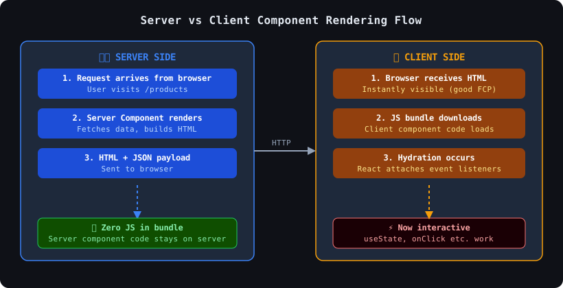
6.2.5 Async Components
Section titled “6.2.5 Async Components”In Next.js App Router, Server Components can be async. This is a superpower — you can await data directly inside a component.
interface User {  id: number;  name: string;  email: string;}
// This component is async — it awaits data before renderingasync function UserPage({ params }: { params: { id: string } }) {  // Direct DB or API call — runs only on server  const user: User = await fetchUserById(params.id);
  if (!user) {    return <p>User not found</p>;  }
  return (    <div>      <h1>{user.name}</h1>      <p>{user.email}</p>    </div>  );}
// Simulated fetch functionasync function fetchUserById(id: string): Promise<User> {  const res = await fetch(`https://api.example.com/users/${id}`, {    cache: "no-store", // Always fresh data  });  return res.json();}
export default UserPage;
6.2.6 Dynamic Components with dynamic()
Section titled “6.2.6 Dynamic Components with dynamic()”Sometimes you want to lazy-load a component — only load it when needed. This is great for performance.
"use client";
import dynamic from "next/dynamic";
// Heavy chart component — loaded only when neededconst HeavyChart = dynamic(() => import("@/components/HeavyChart"), {  loading: () => <p>Loading chart...</p>, // Shown while loading  ssr: false, // Don't render on server (useful for browser-only libs)});
// Modal loaded on demandconst Modal = dynamic(() => import("@/components/Modal"), {  loading: () => <div className="skeleton" />,});
export default function DashboardPage() {  return (    <div>      <h1>Dashboard</h1>      <HeavyChart />      <Modal />    </div>  );}
When to use
dynamic()?
- Components using heavy libraries (charts, editors, maps)
- Browser-only components (use
ssr: false)- Components not needed on initial page load
6.3 Hydration Explained
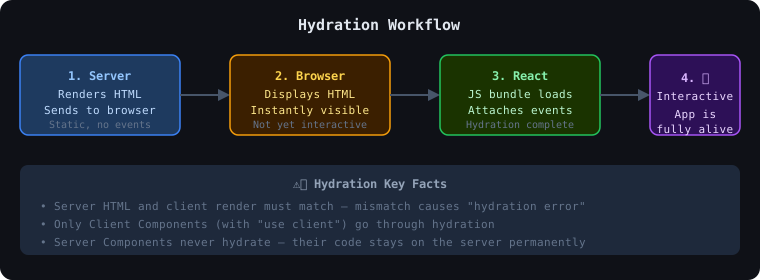
Section titled “6.3 Hydration Explained”Hydration is the process where React takes the static HTML sent by the server and “wakes it up” by attaching JavaScript event listeners.
Analogy: Think of a mannequin (static HTML) being turned into a real person who can interact (hydrated React app).
6.4 Props, Children, and Composition
Section titled “6.4 Props, Children, and Composition”Props are inputs passed to a component — like function arguments.
interface UserCardProps {  name: string;  email: string;  avatarUrl?: string; // Optional prop  role: "admin" | "user" | "moderator";}
function UserCard({ name, email, avatarUrl, role }: UserCardProps) {  return (    <div className="card">      {avatarUrl && <img src={avatarUrl} alt={name} />}      <h2>{name}</h2>      <p>{email}</p>      <span className={`badge badge-${role}`}>{role}</span>    </div>  );}
// Usage<UserCard name="Priya" email="priya@example.com" role="admin" />
Children
Section titled “Children”Children let you nest content inside a component — like a container.
interface CardProps {  title: string;  children: React.ReactNode; // Accepts any JSX}
function Card({ title, children }: CardProps) {  return (    <div className="card">      <h2 className="card-title">{title}</h2>      <div className="card-body">{children}</div>    </div>  );}
// Usage — pass any content inside<Card title="My Profile">  <p>Name: Rahul</p>  <p>Age: 25</p>  <button>Edit</button></Card>
Composition Pattern
Section titled “Composition Pattern”The Composition Pattern builds complex UIs from small, focused components.
// components/Dashboard.tsx — Full composition example
function StatCard({ label, value }: { label: string; value: string }) {  return (    <div className="stat-card">      <p className="label">{label}</p>      <h3 className="value">{value}</h3>    </div>  );}
function StatsRow() {  return (    <div className="stats-row">      <StatCard label="Total Users" value="12,400" />      <StatCard label="Revenue" value="₹4,20,000" />      <StatCard label="Orders" value="890" />    </div>  );}
function Dashboard() {  return (    <main>      <h1>Dashboard</h1>      <StatsRow />      {/* More composed sections */}    </main>  );}
6.5 Reusable Component Examples
Section titled “6.5 Reusable Component Examples”Reusable Button Component
Section titled “Reusable Button Component”"use client";
interface ButtonProps { variant?: "primary" | "secondary" | "danger"; size?: "sm" | "md" | "lg"; isLoading?: boolean; disabled?: boolean; onClick?: () => void; children: React.ReactNode; type?: "button" | "submit" | "reset";}
const sizeClasses = { sm: "px-3 py-1.5 text-sm", md: "px-4 py-2 text-base", lg: "px-6 py-3 text-lg",};
const variantClasses = { primary: "bg-blue-600 hover:bg-blue-700 text-white", secondary: "bg-gray-200 hover:bg-gray-300 text-gray-800", danger: "bg-red-600 hover:bg-red-700 text-white",};
export function Button({ variant = "primary", size = "md", isLoading = false, disabled = false, onClick, children, type = "button",}: ButtonProps) { return ( <button type={type} onClick={onClick} disabled={disabled || isLoading} className={` rounded-lg font-medium transition-colors ${sizeClasses[size]} ${variantClasses[variant]} ${disabled || isLoading ? "opacity-50 cursor-not-allowed" : "cursor-pointer"} `} > {isLoading ? ( <span className="flex items-center gap-2"> <span className="spinner" /> Loading... </span> ) : ( children )} </button> );}Card Component
Section titled “Card Component”interface CardProps { title?: string; subtitle?: string; footer?: React.ReactNode; className?: string; children: React.ReactNode;}
export function Card({ title, subtitle, footer, className = "", children }: CardProps) { return ( <div className={`bg-white rounded-xl shadow-md overflow-hidden ${className}`}> {(title || subtitle) && ( <div className="px-6 py-4 border-b"> {title && <h2 className="text-lg font-semibold">{title}</h2>} {subtitle && <p className="text-sm text-gray-500">{subtitle}</p>} </div> )} <div className="p-6">{children}</div> {footer && ( <div className="px-6 py-3 bg-gray-50 border-t">{footer}</div> )} </div> );}Modal Component
Section titled “Modal Component”"use client";
import { useEffect } from "react";
interface ModalProps { isOpen: boolean; onClose: () => void; title: string; children: React.ReactNode;}
export function Modal({ isOpen, onClose, title, children }: ModalProps) { // Close on Escape key press useEffect(() => { const handleEsc = (e: KeyboardEvent) => { if (e.key === "Escape") onClose(); }; window.addEventListener("keydown", handleEsc); return () => window.removeEventListener("keydown", handleEsc); }, [onClose]);
if (!isOpen) return null;
return ( // Backdrop <div className="fixed inset-0 bg-black/50 flex items-center justify-center z-50" onClick={onClose} > {/* Modal box — stop click propagation */} <div className="bg-white rounded-xl w-full max-w-md p-6 shadow-xl" onClick={(e) => e.stopPropagation()} > <div className="flex justify-between items-center mb-4"> <h2 className="text-xl font-bold">{title}</h2> <button onClick={onClose} className="text-gray-400 hover:text-gray-600"> ✕ </button> </div> {children} </div> </div> );}6.6 Component Hierarchy Diagram
Section titled “6.6 Component Hierarchy Diagram”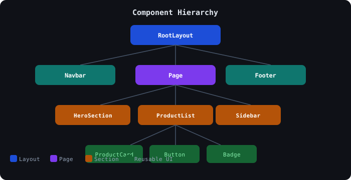
6.7 Folder Organization Best Practices
Section titled “6.7 Folder Organization Best Practices”src/├── app/ # Next.js App Router pages│ ├── layout.tsx│ ├── page.tsx│ └── dashboard/│ └── page.tsx├── components/│ ├── ui/ # Generic reusable components│ │ ├── Button.tsx│ │ ├── Card.tsx│ │ ├── Modal.tsx│ │ └── Input.tsx│ ├── layout/ # Layout components│ │ ├── Navbar.tsx│ │ ├── Footer.tsx│ │ └── Sidebar.tsx│ └── features/ # Feature-specific components│ ├── auth/│ │ └── LoginForm.tsx│ └── dashboard/│ └── StatsWidget.tsx├── hooks/ # Custom React hooks├── lib/ # Utility functions└── types/ # TypeScript interfaces6.8 Common Mistakes
Section titled “6.8 Common Mistakes”| ❌ Mistake | ✅ Fix |
|---|---|
Using useState in a Server Component | Add "use client" directive |
Forgetting "use client" for event handlers | Always add for onClick, onChange etc. |
| Making everything a Client Component | Use Server Components by default |
| Prop drilling through many levels | Use React Context or Zustand |
| Not typing props in TypeScript | Always define interface for props |
| Huge components with 500+ lines | Break into smaller focused components |
useEffect for data fetching | Fetch in Server Components instead |
6.9 Interview Questions — Components
Section titled “6.9 Interview Questions — Components”- What is the difference between Server and Client Components in Next.js?
- Why can’t you use
useStatein a Server Component? - What does the
"use client"directive do exactly? - What is hydration? What causes a hydration error?
- When would you use
dynamic()instead of a normal import? - What is the Composition Pattern? Give an example.
- How do you pass data between sibling components?
- What is the difference between
propsandstate? - Can a Server Component render a Client Component? Vice versa?
- What is
React.ReactNodevsReact.ReactElement?