
Styling in Next.js
Section 7: Styling in Next.js
Section titled “Section 7: Styling in Next.js”7.1 How Styling Works in Next.js
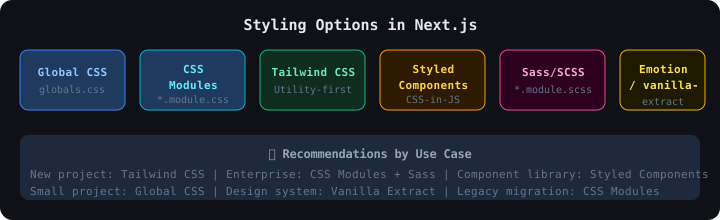
Section titled “7.1 How Styling Works in Next.js”Next.js supports multiple styling approaches. Understanding each helps you pick the right tool.
7.2 Global CSS
Section titled “7.2 Global CSS”Global styles apply everywhere in your app. Import once in layout.tsx.
/* CSS Variables for theming */:root {  --color-primary: #3b82f6;  --color-bg: #ffffff;  --color-text: #1f2937;  --font-body: "Inter", sans-serif;  --radius: 8px;}
/* Dark mode */[data-theme="dark"] {  --color-bg: #0f172a;  --color-text: #e2e8f0;}
/* Reset & base styles */*, *::before, *::after {  box-sizing: border-box;  margin: 0;  padding: 0;}
body {  font-family: var(--font-body);  background-color: var(--color-bg);  color: var(--color-text);  line-height: 1.6;}
/* Utility classes */.container {  max-width: 1200px;  margin: 0 auto;  padding: 0 1rem;}
// app/layout.tsx — Import globals hereimport "./globals.css";
export default function RootLayout({ children }: { children: React.ReactNode }) { return ( <html lang="en"> <body>{children}</body> </html> );}7.3 CSS Modules
Section titled “7.3 CSS Modules”CSS Modules provide scoped CSS — class names are automatically unique, preventing style conflicts.
.button {  padding: 0.5rem 1rem;  border-radius: 6px;  border: none;  cursor: pointer;  font-weight: 600;  transition: background 0.2s;}
.primary {  background-color: #3b82f6;  color: white;}
.primary:hover {  background-color: #2563eb;}
.secondary { background-color: #e5e7eb; color: #374151;}import styles from "./Button.module.css";
// Combining multiple class namesfunction Button({ variant = "primary", children }: ButtonProps) { return ( <button className={`${styles.button} ${styles[variant]}`}> {children} </button> );}✅ CSS Modules automatically scope class names.
.buttonbecomes.Button_button__xyz123in production — no clashes!
7.4 Tailwind CSS
Section titled “7.4 Tailwind CSS”Tailwind is a utility-first CSS framework — instead of writing custom CSS, you apply small utility classes.
Setup Tailwind in Next.js
Section titled “Setup Tailwind in Next.js”# 1. Installnpm install -D tailwindcss postcss autoprefixer
# 2. Initializenpx tailwindcss init -pimport type { Config } from "tailwindcss";
const config: Config = { content: [ "./pages/**/*.{js,ts,jsx,tsx,mdx}", "./components/**/*.{js,ts,jsx,tsx,mdx}", "./app/**/*.{js,ts,jsx,tsx,mdx}", ], darkMode: "class", // Enable class-based dark mode theme: { extend: { colors: { brand: { 50: "#eff6ff", 500: "#3b82f6", 900: "#1e3a8a", }, }, }, }, plugins: [],};
export default config;/* globals.css — add Tailwind directives */@tailwind base;@tailwind components;@tailwind utilities;Tailwind Example
Section titled “Tailwind Example”// Responsive product card with dark modefunction ProductCard({ name, price, image }: Product) { return ( <div className=" bg-white dark:bg-gray-800 rounded-xl shadow-md overflow-hidden hover:shadow-xl transition-shadow duration-300 flex flex-col "> <img src={image} alt={name} className="w-full h-48 object-cover" /> <div className="p-4 flex-1 flex flex-col justify-between"> <h3 className="text-lg font-semibold text-gray-900 dark:text-white"> {name} </h3> <div className="mt-3 flex items-center justify-between"> <span className="text-2xl font-bold text-blue-600">₹{price}</span> <button className=" bg-blue-600 hover:bg-blue-700 text-white font-medium px-4 py-2 rounded-lg transition-colors "> Add to Cart </button> </div> </div> </div> );}7.5 Sass/SCSS
Section titled “7.5 Sass/SCSS”Sass adds superpowers to CSS — variables, nesting, mixins, loops.
Setup Sass
Section titled “Setup Sass”npm install --save-dev sass// Variables$primary: #3b82f6;$danger: #ef4444;$radius: 8px;
// Mixin for reusable styles@mixin button-variant($bg, $hover) { background-color: $bg; &:hover { background-color: $hover; }}
.button { padding: 0.5rem 1.25rem; border-radius: $radius; border: none; cursor: pointer; font-weight: 600; transition: background 0.2s, transform 0.1s;
// Nested selector &:active { transform: scale(0.97); }
// Variants using mixin &--primary { @include button-variant($primary, darken($primary, 10%)); color: white; }
&--danger { @include button-variant($danger, darken($danger, 10%)); color: white; }}// Use as CSS Moduleimport styles from "./button.module.scss";
<button className={`${styles.button} ${styles["button--primary"]}`}> Click Me</button>7.6 Dark Mode Implementation
Section titled “7.6 Dark Mode Implementation”"use client";
import { useState, useEffect } from "react";
export function ThemeToggle() { const [theme, setTheme] = useState<"light" | "dark">("light");
useEffect(() => { // Check saved preference const saved = localStorage.getItem("theme") as "light" | "dark" | null; const systemPrefers = window.matchMedia("(prefers-color-scheme: dark)").matches; const initial = saved ?? (systemPrefers ? "dark" : "light");
setTheme(initial); document.documentElement.classList.toggle("dark", initial === "dark"); }, []);
const toggleTheme = () => { const next = theme === "light" ? "dark" : "light"; setTheme(next); document.documentElement.classList.toggle("dark", next === "dark"); localStorage.setItem("theme", next); };
return ( <button onClick={toggleTheme} className="p-2 rounded-full bg-gray-200 dark:bg-gray-700" aria-label="Toggle theme" > {theme === "light" ? "🌙" : "☀️"} </button> );}7.7 Responsive Design
Section titled “7.7 Responsive Design”Mobile-First Approach
Section titled “Mobile-First Approach”In Tailwind, write for mobile first, then add breakpoint prefixes for larger screens:
<div className=" grid grid-cols-1 // Mobile: 1 column sm:grid-cols-2 // ≥640px: 2 columns md:grid-cols-3 // ≥768px: 3 columns lg:grid-cols-4 // ≥1024px: 4 columns gap-4"> {products.map(p => <ProductCard key={p.id} {...p} />)}</div>Tailwind Breakpoints
Section titled “Tailwind Breakpoints”| Prefix | Min Width | Use Case |
|---|---|---|
| (none) | 0px | Mobile phones |
sm: | 640px | Large phones |
md: | 768px | Tablets |
lg: | 1024px | Desktops |
xl: | 1280px | Large desktops |
2xl: | 1536px | Wide screens |
7.8 Styling Comparison Tables
Section titled “7.8 Styling Comparison Tables”Tailwind CSS vs CSS Modules
Section titled “Tailwind CSS vs CSS Modules”| Feature | Tailwind CSS | CSS Modules |
|---|---|---|
| Write CSS? | ❌ No — utility classes only | ✅ Yes — write real CSS |
| Bundle size | Small (purged at build) | Grows with your CSS |
| Learning curve | Medium | Low |
| Customization | High (config file) | Full control |
| Readable HTML | ❌ Long classNames | ✅ Semantic names |
| Design system | ✅ Built-in | Manual |
| Best for | Fast prototyping | Enterprise / isolation |
CSS-in-JS vs Traditional CSS
Section titled “CSS-in-JS vs Traditional CSS”| CSS-in-JS (Styled Components) | Traditional CSS/Modules | |
|---|---|---|
| Dynamic styles | ✅ Via props | ❌ Need inline or JS |
| TypeScript support | ✅ Full | Partial |
| SSR complexity | ⚠️ Needs extra setup | ✅ Simple |
| Performance | ⚠️ Runtime overhead | ✅ No overhead |
| Bundle size | Larger | Smaller |
| Developer experience | ✅ Co-located | Separate files |
7.9 Common Mistakes in Styling
Section titled “7.9 Common Mistakes in Styling”| ❌ Mistake | ✅ Fix |
|---|---|
| Importing CSS modules in Server Components without issue — using dynamic classnames | Use cn() utility or static conditions |
| Not purging Tailwind — huge CSS bundle | Set content in tailwind.config properly |
| Global styles bleeding into components | Use CSS Modules for component styles |
| Inline styles for everything | Use Tailwind utilities or CSS Modules |
| No CSS variables for theming | Define --var in :root |
7.10 Interview Questions — Styling
Section titled “7.10 Interview Questions — Styling”- What is the difference between global CSS and CSS Modules?
- How does Tailwind CSS reduce bundle size in production?
- What is the purpose of
@tailwind base,@tailwind components,@tailwind utilities? - How do you implement dark mode in Next.js with Tailwind?
- What is CSS-in-JS? Name two libraries.
- Why might CSS Modules be preferred in a large team?
- What does
mobile-firstmean in responsive design? - How do you combine multiple class names in CSS Modules?